These strengths are to be expressed in the new corporate design.
As a leading company in the field of plant and mechanical engineering, we combine innovative strength, international competitiveness and regional added value.
The new corporate design includes a comprehensive revision of the visual appearance to make the brand more modern and appealing. The most important elements are:
01
LOGO
The new logo combines technological precision and industrial strength. It uses clear lines and geometric shapes to emphasize the technical excellence and precision of KMF Group.
02
Colour scheme
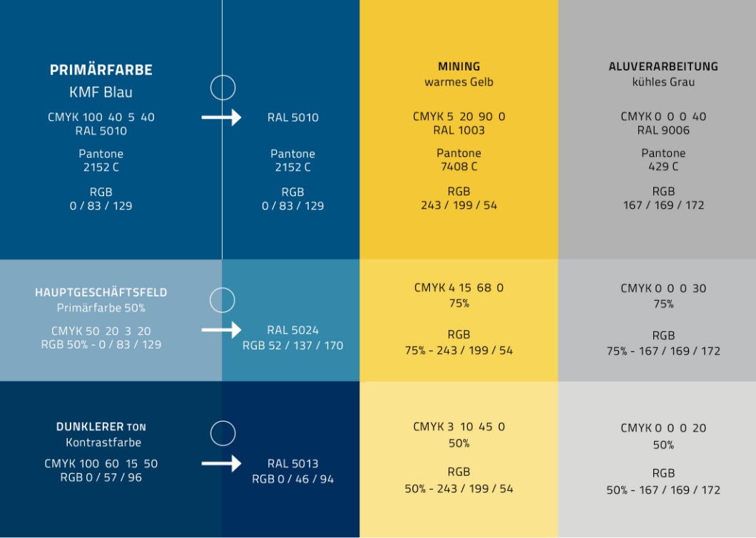
The colour palette has been updated to incorporate modern and trustworthy tones. The main colours are a deep blue, a signal yellow and a light grey, which indicate stability and reliability, while the accent colours represent innovative and dynamic aspects.
03
Typography
A new, clean and modern typeface has been introduced that is easy to read in both print and digital media. The main typeface, Titilium Web, is a sans serif typeface that embodies precision and innovation.
04
GRAPHIC ELEMENTS
The design includes technical illustrations and icons that represent KMF's various products and services. These elements are kept in a minimalist style that highlights the technical aspects and engineering skills of KMF Group.
05
APPLICATION
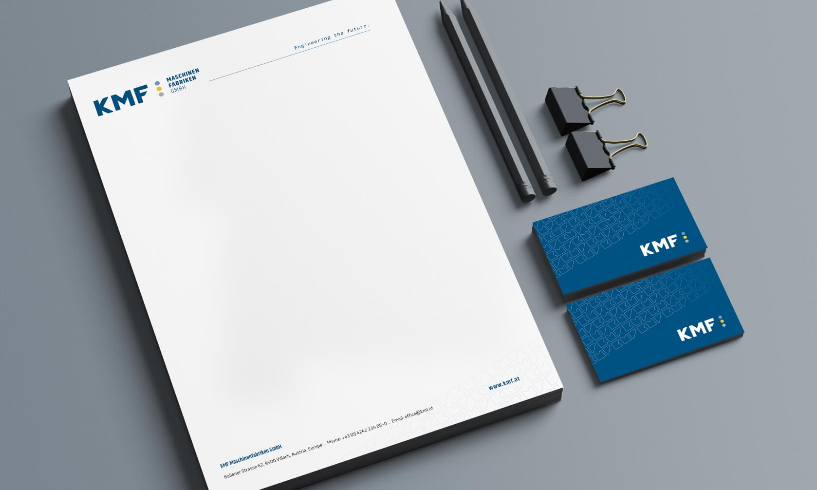
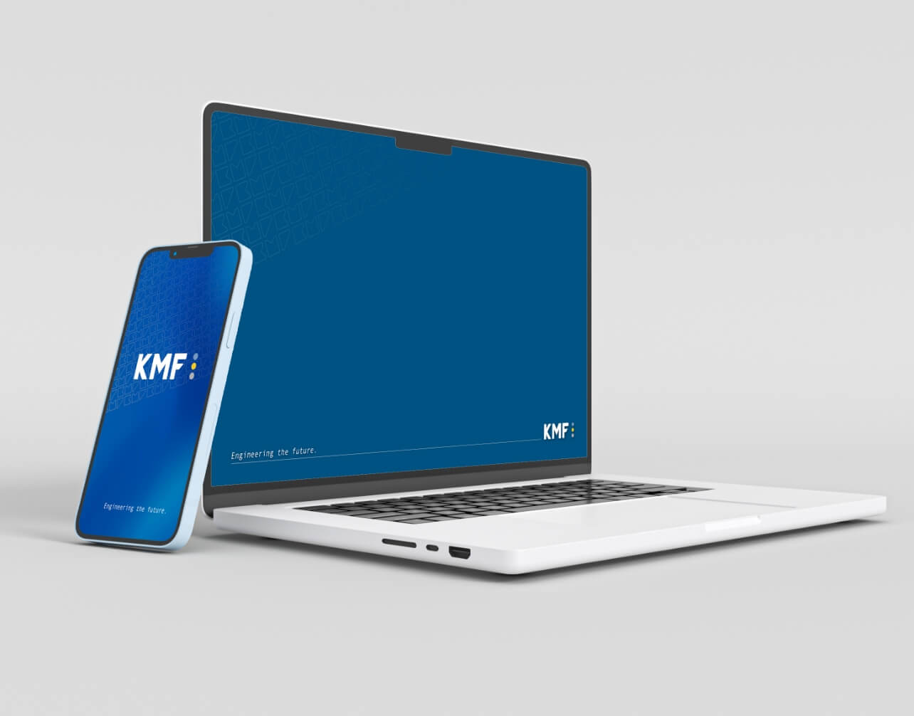
The new corporate design is used on all company materials, including business cards, letterhead, brochures, website, social media channels and transport packaging. All applications are designed consistently to ensure brand recognition.
06
IMAGERY
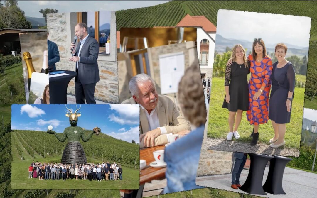
The imagery relies on high-quality photographs of machines, production facilities and employees in action. These images are intended to emphasize the technical competence and human side of KMF Group.
07
SLOGAN
A new slogan that communicates the core values and promise of KMF Group has also been introduced. It is “Engineering the Future”.
